From Track & Trace to Endoscopy Hub: A Journey in User-Centred Design
In 2021, I embarked on a UX adventure with STERIS, a leader in surgical instrument reprocessing and decontamination. Collaborating with a fellow designer, we tackled the challenge of optimising their existing "track and trace solution" for improved instrument tracking within hospital workflows. Efficiency and user-friendliness were paramount.
But this case study takes a different turn. Instead of diving into the track & trace project, we'll explore another endeavour that blossomed during my time at STERIS: the Endoscopy "Hub." Imagine a hospital environment where endoscopy technicians, often burdened by complex workflows, navigate their tasks with ease. That's what the "Hub" aimed to achieve – an intuitive interface prioritising critical information and streamlining their daily processes.
While personal circumstances led me elsewhere, the "Hub" remains a potent example of user-centered design in action, even in its unfinished state. Through this case study, you'll embark on a journey that unveils:
- The pain points of endoscopy technicians and their impact on efficiency.
- The creative ideation process, drawing inspiration from diverse sources to find solutions.
- The development of initial wireframes, shaped by user feedback and constant refinement.
- The "Hub's" potential future and the lessons learned along the way.
Despite its unfinished nature, the "Hub" serves as a seed, ready to blossom into a valuable tool for endoscopy technicians. Join me as we explore the world of user-centred design, its challenges, and its power to unlock positive change.
Proof of Impact: Fast-Tracking Transformation with a POC
While the initial kick-off meeting buzzed with excitement, the ambitious 5-year timeline loomed large. To accelerate progress and prove the efficacy of my design vision, I proposed a focused year-long Proof of Concept (POC). This POC would serve as a springboard, validating key design decisions and securing stakeholder buy-in for the broader redesign.
The concept?
Empowering STERIS employees and hospital staff across the UK and US to meticulously document all activities related to the decontamination and sterile reprocessing of endoscopes through a seamless "track and trace" system.
This comprehensive documentation, accessible by both internal teams and customers, would track each endoscope at every stage of the reprocessing cycle, enhancing efficiency, transparency, and patient safety. This bold move set the stage for an expedited transformation journey.
Understanding the Scope: Endoscopes & the Reprocessing Journey
As the lead UX designer on this POC, I was determined to create a "hub" design that truly revolutionised endoscope reprocessing and traceability.
Embracing the freedom to explore, I took the lead in understanding the intricate journey of endoscopes. This involved conducting in-depth interviews with reprocessing technicians, analysing existing data on error rates and delays, and even shadowing hospital staff to observe their workflows firsthand.
Through this immersive research, I gained a comprehensive understanding of the challenges they faced, from outdated tracking systems to inefficient communication, and the critical need for transparency and improved efficiency.
These insights became the fuel for my creative engine, guiding every design decision in crafting the ambitious "hub" design.
Unveiling the "Why": Reframing Feature Ideas into Meaningful Opportunities
Unlike past projects with clear problem statements, this POC presented a unique challenge: an intriguing feature idea without a readily identifiable pain point. However, I saw this as an opportunity to uncover the true potential behind the feature.
Instead of passively accepting the idea, I took the initiative to reframe it as an opportunity.
Leading a series of ideation sessions, I brought together diverse perspectives: my line manager, Gargee (my UX teammate), and Rich, a business analyst. Through thought-provoking questions, I guided our exploration:
- Why does this "Endoscopy Hub" exist?
- Is it solely an information dashboard, or is there a deeper need it fulfils?
- What real-world problems could it address?
- Are we focusing on the most impactful challenge in the reprocessing workflow?
- Are we tackling the right root cause?
By exploring these critical questions, I aimed to shift the focus from features to meaningful opportunities. This collaborative process ensured my design efforts were well-aligned with both business goals and user needs.
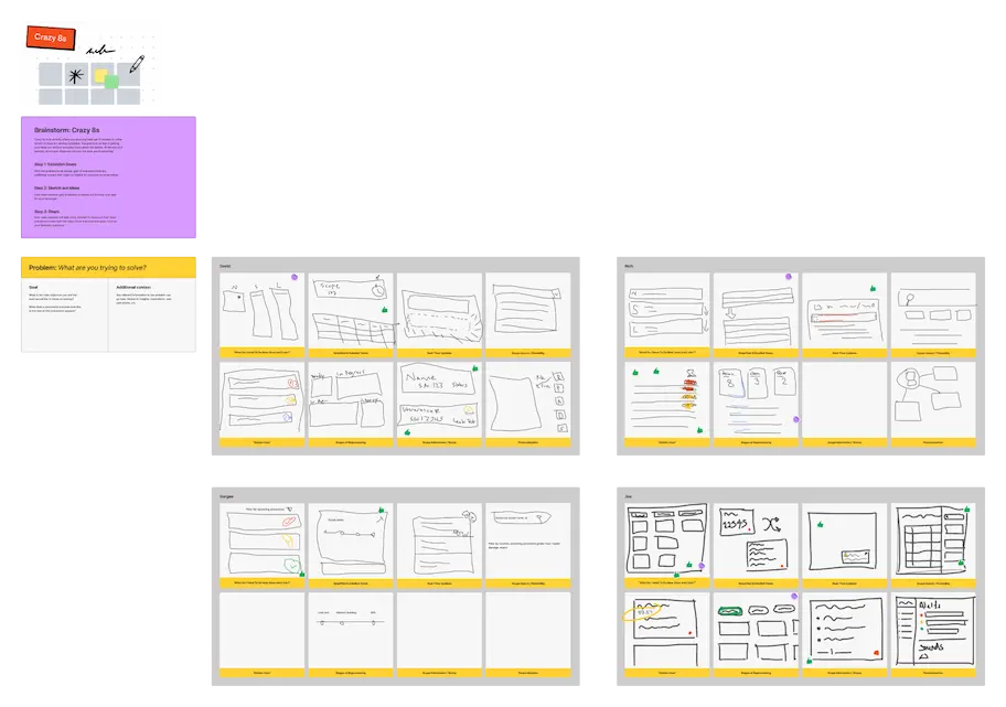
Remote Brainstorming: Sparking Innovation Across Time Zones
With the team scattered across different regions, embracing remote collaboration was essential.
To spark creative ideas, I chose FigJam, a real-time collaborative tool by Figma. While it was my first time using it, I opted for the potential benefits of seamless interaction despite any initial learning curve. Thankfully, the experience proved positive and engaging for everyone involved.
To ignite the brainstorm, I set an 8-minute timer, challenging each participant to individually sketch out as many ideas as possible.
This exercise aimed to capture the unique needs and expectations of different user types potentially interacting with the envisioned solution.
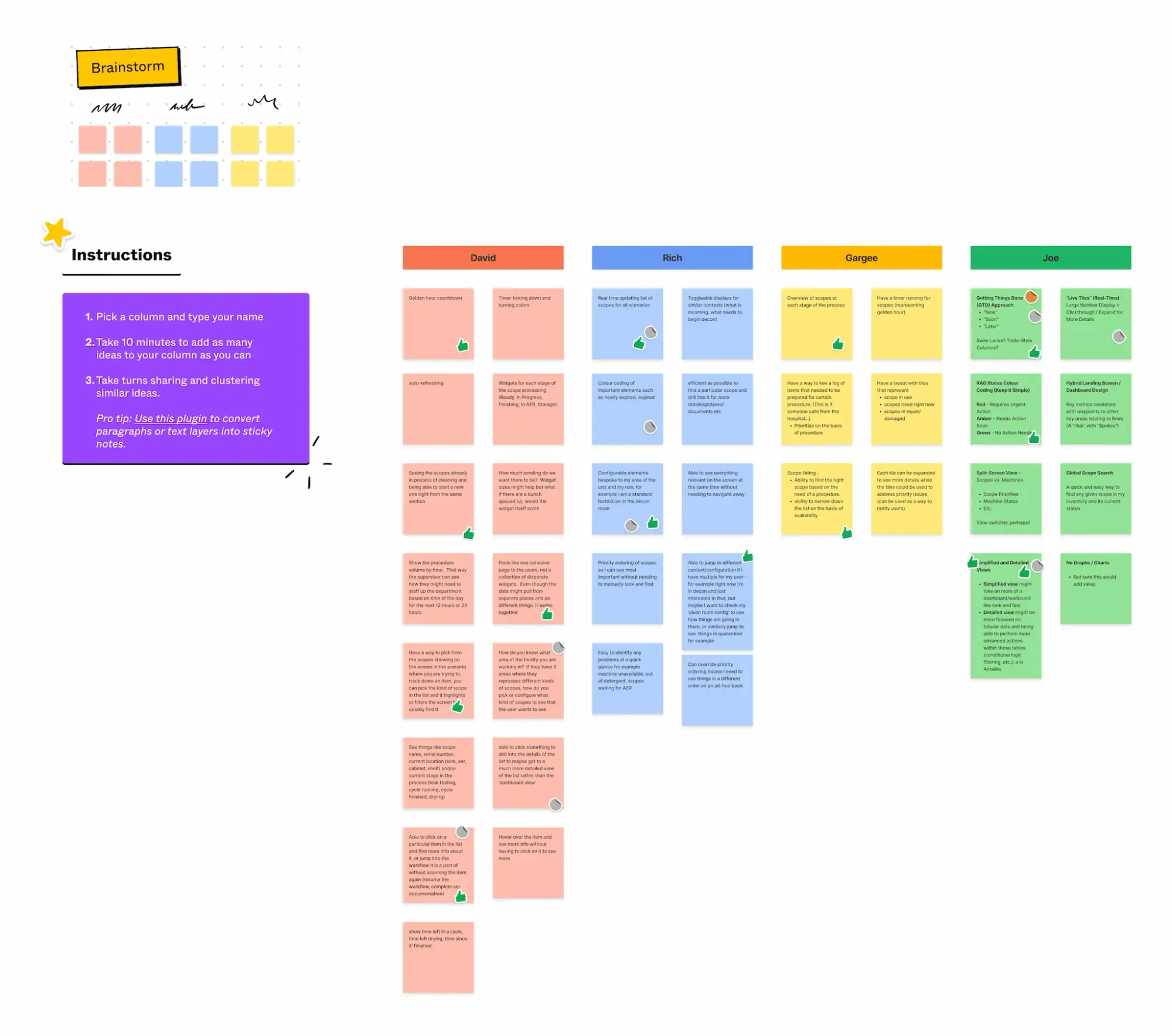
Empowering Choice: Prioritising Ideas with Dot Voting
Following the initial brainstorm, I needed to streamline our diverse ideas into a focused direction. Recognising the value of collective decision-making, I proposed implementing "dot voting." This method empowers each participant to actively contribute by allocating their "votes" to the concepts they considered most promising.
This approach proved highly effective. It fostered discussion and debate, ensuring everyone's voice was heard and considered. Ultimately, through collaborative dot voting, I identified the high-level concepts with the most potential, setting the stage for further refinement and development.
Connecting the Dots: Unifying Ideas into Themes
The dot voting served its purpose, leaving me with a handful of promising high-level concepts. But the journey didn't end there. I was determined to delve deeper, seeking hidden connections and patterns within the diverse ideas generated. So, I took it upon myself to embark on a meticulous categorisation process.
This involved meticulously grouping the various ideas based on shared themes, functionalities, or target user needs. Through this analysis, I aimed to unlock new avenues of exploration, revealing potential synergies and connections I might have otherwise missed. This approach proved fruitful, uncovering several recurring themes that served as valuable building blocks for the next stage of design development.
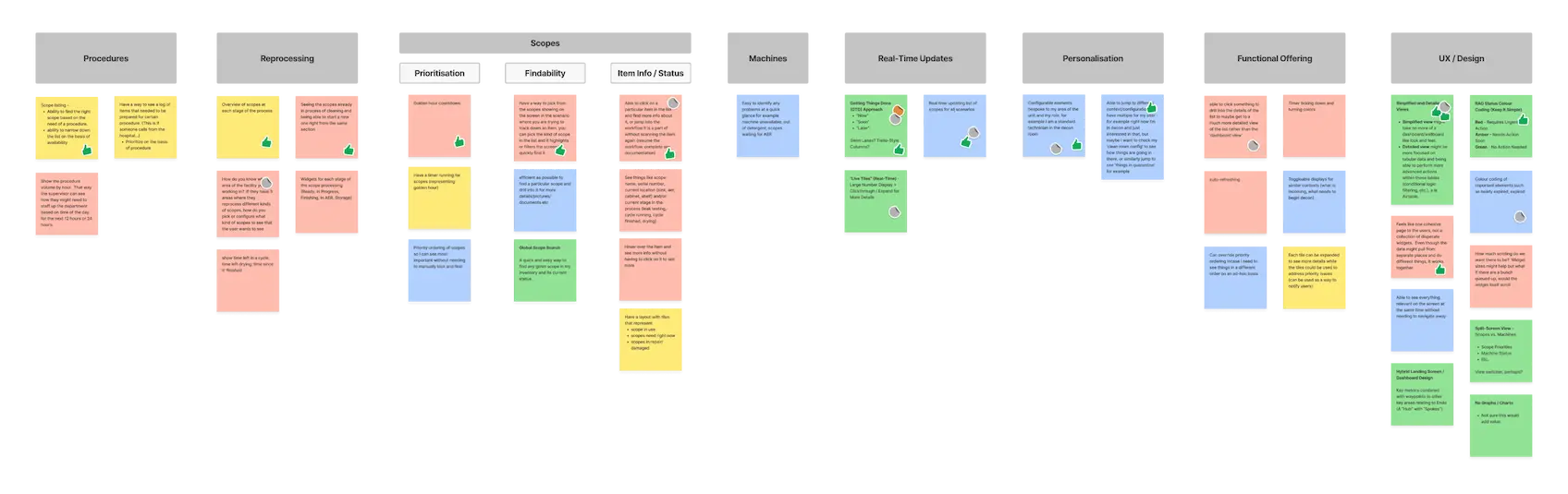
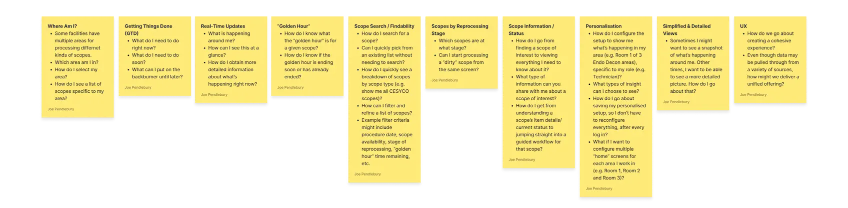
Sharpening the Focus: From Themes to Targeted Questions
Following the thematic analysis, I embarked on further refinement. Each identified theme was meticulously streamlined into distinct, well-defined groups. To ensure clear direction and encourage deeper exploration, I also translated these themes into a series of thought-provoking questions. These questions served as stepping stones, guiding our design thinking process and stimulating further discussion around potential solutions.
While I wasn't familiar with the "How Might We" framework at the time, these questions inherently captured its essence by posing challenges and prompting innovative solutions.
In retrospect, explicitly phrasing them as "How Might We" statements would have further emphasised this approach.
Unleashing Creativity: Diving into "Crazy 8s"
To propel our exploration further, I facilitated a dynamic "Crazy 8s" exercise during the second ideation session. This fast-paced sketching activity challenged participants to unleash their creativity, generating eight unique design ideas within a mere eight minutes.
The goal? Translate the newly identified themes and thought-provoking questions into tangible solutions. While the time pressure might seem daunting, especially for those new to the exercise, it fostered a spirit of innovation and rapid ideation.
While a few participants encountered initial hurdles in filling all eight sketch boxes, understandable for a first encounter with this method, their enthusiasm and diverse perspectives shone through.
Following this flurry of ideas, we employed another round of dot voting, allowing everyone to voice their preferences and identify the most promising concepts.
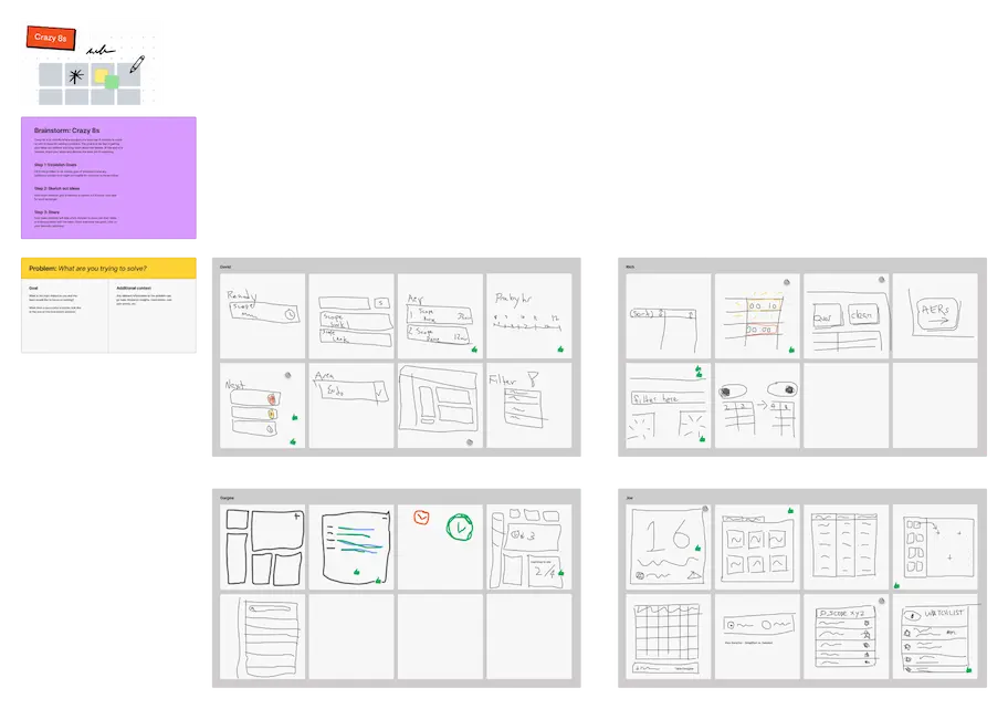
Refining the Exploration: Themed "Crazy 8s" Take Two
Recognising the need for further refinement, I spearheaded a second round of "Crazy 8s" during the same session.
This time, I implemented a strategic twist: assigning a specific theme to each of the eight sketch boxes.
This targeted approach addressed the initial challenges some participants faced and directly aligned with my goal of guiding our exploration towards the most impactful themes.
This thematic direction proved highly effective. It provided participants with clear prompts and facilitated the generation of highly focused ideas within each assigned area. This strategic shift empowered everyone to delve deeper into specific challenges and potential solutions, ultimately yielding a richer and more diverse set of concepts for consideration.
Embracing Remote Constraints: Lessons Learned from "Crazy 8s"
While the "Crazy 8s" exercise sparked creative energy, we collectively recognised the challenge of sketching ideas using a mouse. Despite everyone's valiant efforts, the limitations of digital drawing tools became apparent.
This highlighted a noteworthy hurdle often encountered in remote design sprints: the lack of pen and paper's fluidity and ease compared to using a computer touchpad or mouse.
Looking forward, I'm excited to explore incorporating tablets and styluses into future remote sessions. This has the potential to bridge the gap, offering a more natural and intuitive sketching experience for participants.
By embracing both the benefits of remote collaboration and the power of tactile creativity, I can help unlock even more innovative solutions in the future.
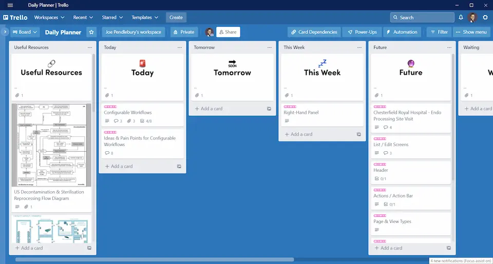
Prioritising Efficiency: Exploring "Getting Things Done®" Integration
Recognising the time constraints faced by our target users, I championed the exploration of David Allen's "Getting Things Done®" (GTD) methodology during the ideation sessions. GTD empowers individuals to manage their workloads effectively, combating overwhelm and fostering focus, clarity, and confidence.
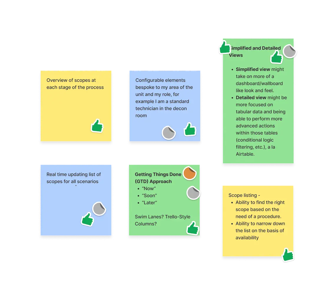
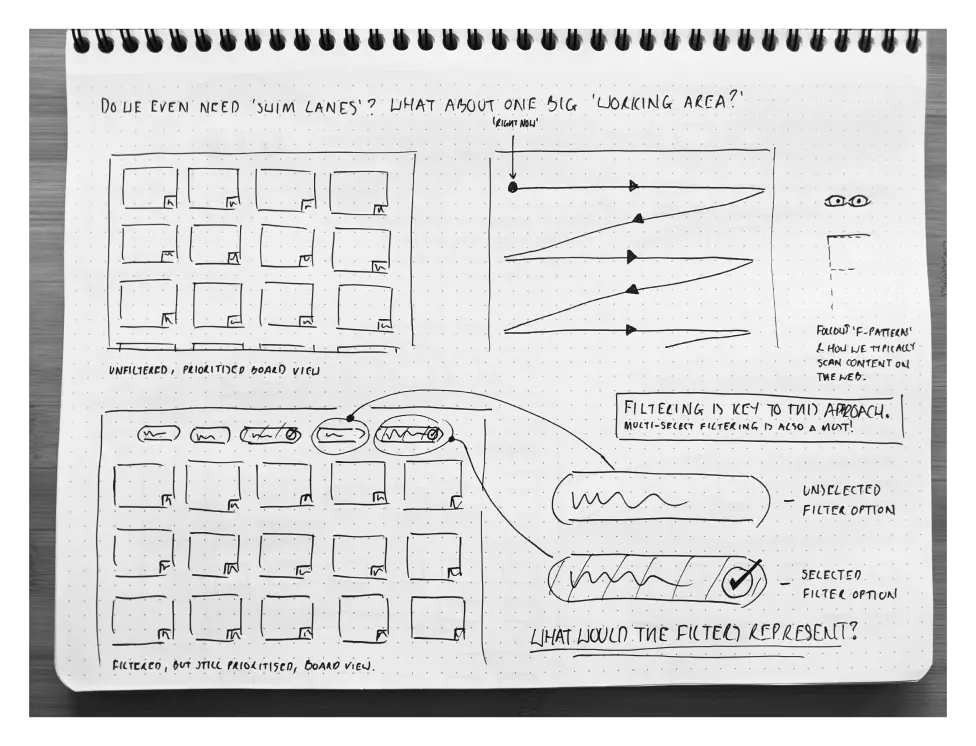
This resonated with my personal experience using a similar approach in Trello to manage my own tasks. Seeing its potential benefit for these users, I envisioned a swimlane-like, column-based solution design. This design aimed to streamline user workflows by clearly displaying essential information and prioritising actions based on urgency.
For instance, one column could showcase immediate tasks requiring immediate attention, while another might highlight upcoming deadlines or longer-term goals. By integrating GTD principles, I aimed to equip users with the tools to navigate their busy schedules efficiently, ultimately enhancing their productivity and reducing stress.
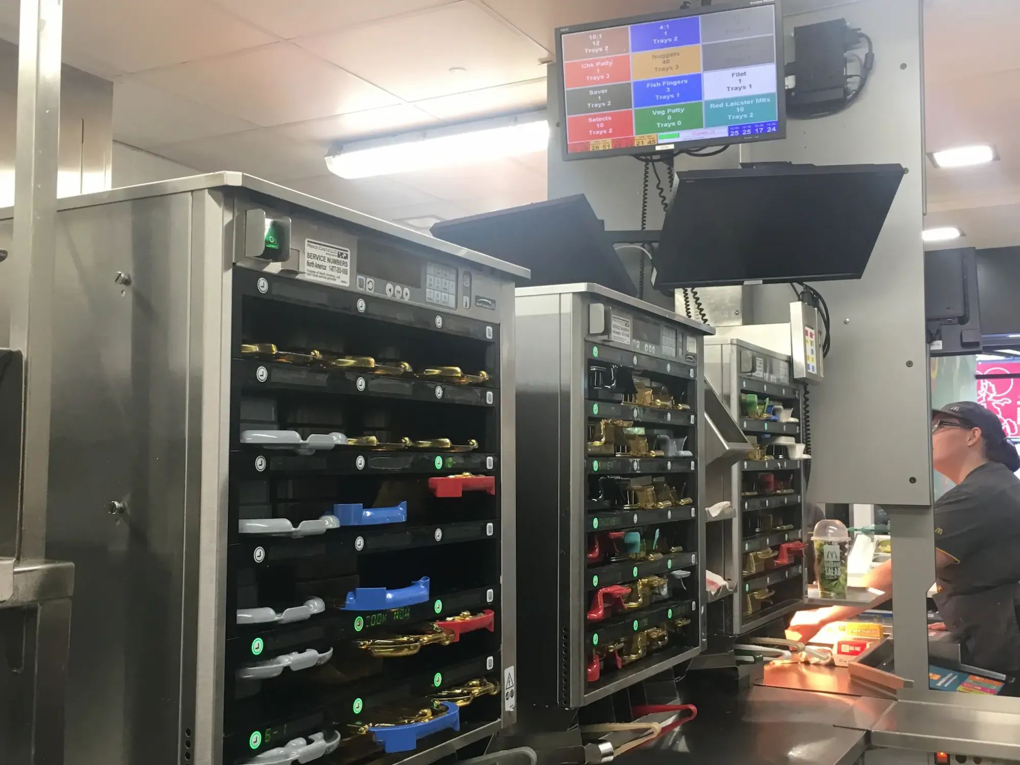
Inspiration Strikes: A Eureka Moment at McDonald's
Sometimes, the best solutions arrive unexpectedly.
During a seemingly unrelated lunch break at McDonald's, a "lightbulb moment" illuminated the path forward for the Endoscopy Hub design. As I stood waiting for my order, a glance at the digital display behind the counter sparked inspiration.
This screen, displaying order details and wait times for McDonald's crew members, held the key I had been searching for. It offered a real-world example of a dynamic information hub, presenting crucial data in a clear and actionable format. My Quarter Pounder never tasted so insightful!
Fuelled by this newfound inspiration, I wasted no time delving into the specifics of the McDonald's display system. Eager to unlock its potential for the Endoscopy Hub, I began exploring how its core elements could be adapted to serve the unique needs of our project.
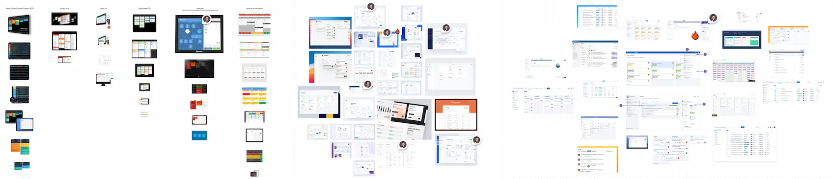
Deconstructing Kitchen Display Systems (KDS): Mining Inspiration for the Hub
With the McDonald's revelation lighting the way, I delved deeper into the world of "Kitchen Display Systems" (KDS).
To gather inspiration and inform my wireframing process, I embarked on a visual research mission. Scouring websites of KDS vendors, Google Images, Behance, and Dribbble, I curated a mood board filled with diverse KDS screenshots and design styles.
This diverse collection served as a rich tapestry of inspiration, sparking ideas and ensuring my wireframes would resonate with established industry best practices.
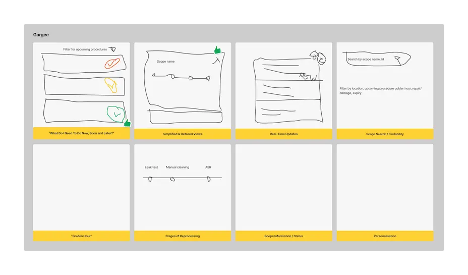
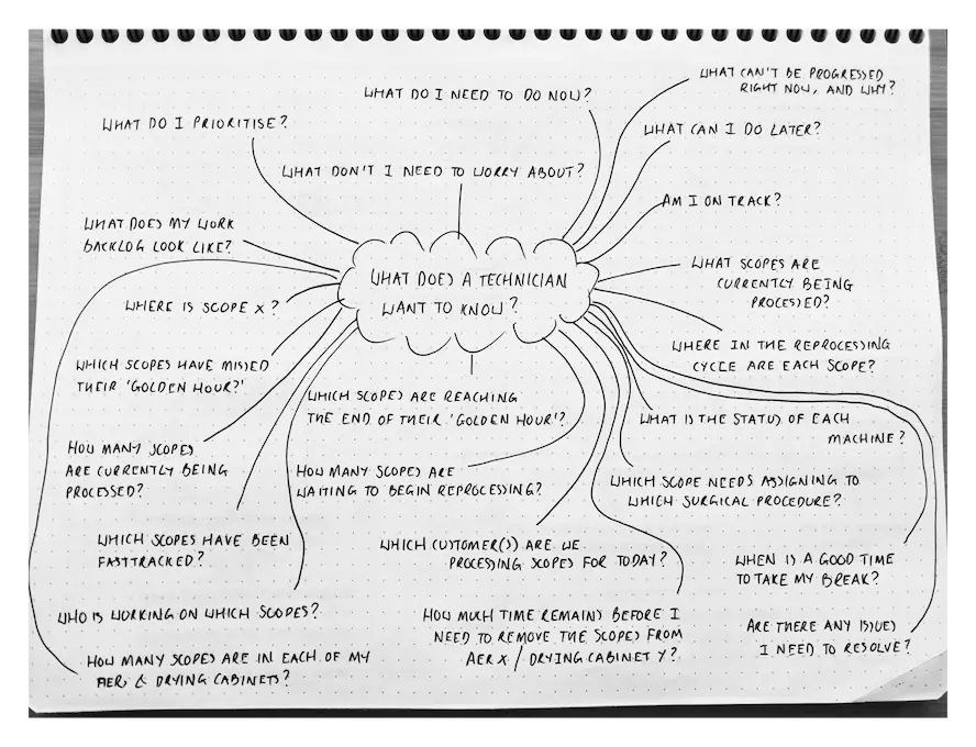
Empathy-Driven Exploration: A Solo Brainstorm for Technician-Centric Design
With wireframing on the horizon, I recognised the need for a focused approach. I initiated an independent brainstorming session dedicated to understanding the specific needs of Technicians, the user group that stood to benefit most from the "Hub."
Previous sessions had identified Technicians as the primary beneficiaries, requiring real-time access to critical information for efficient endoscope decontamination and sterilisation.
To refine the design further, I embarked on a solo deep dive, leveraging the wealth of insights I had gathered.
This included not only the previous brainstorming exercises but also my personal observations, conversations, and the strong relationships I had built with Technicians during on-site hospital and reprocessing facility visits.
Immersing myself in their world allowed me to gain a nuanced understanding of their challenges, workflows, and information needs.
By consolidating these varied perspectives, I aimed to create a highly focused brainstorming session that would directly translate into user-centric wireframes. This solo exploration proved invaluable, laying the groundwork for a design that truly addressed the unique requirements of Technicians within the "Hub" ecosystem.
From Paper to Prototype: Crafting the "Hub" Wireframes
With the insights gathered, it was time to translate them into tangible form. For initial concepts, I embraced the tactile satisfaction and fluidity of pen on paper.
Using a fine line Sharpie on dot grid paper, I sketched a range of low-fidelity wireframes. This approach offered a fast and direct method to explore layouts and information hierarchy without getting bogged down in digital complexities. It also helped me maintain a focused environment conducive to creative exploration.
However, for larger projects demanding greater refinement and multiple screen designs, I seamlessly transitioned to Whimsical. This digital workspace proved invaluable, equipped with a library of UI components that streamlined the iteration process.
The combination of these tools, each suited to specific stages of the design journey, ensured efficient and effective wireframing throughout the project.
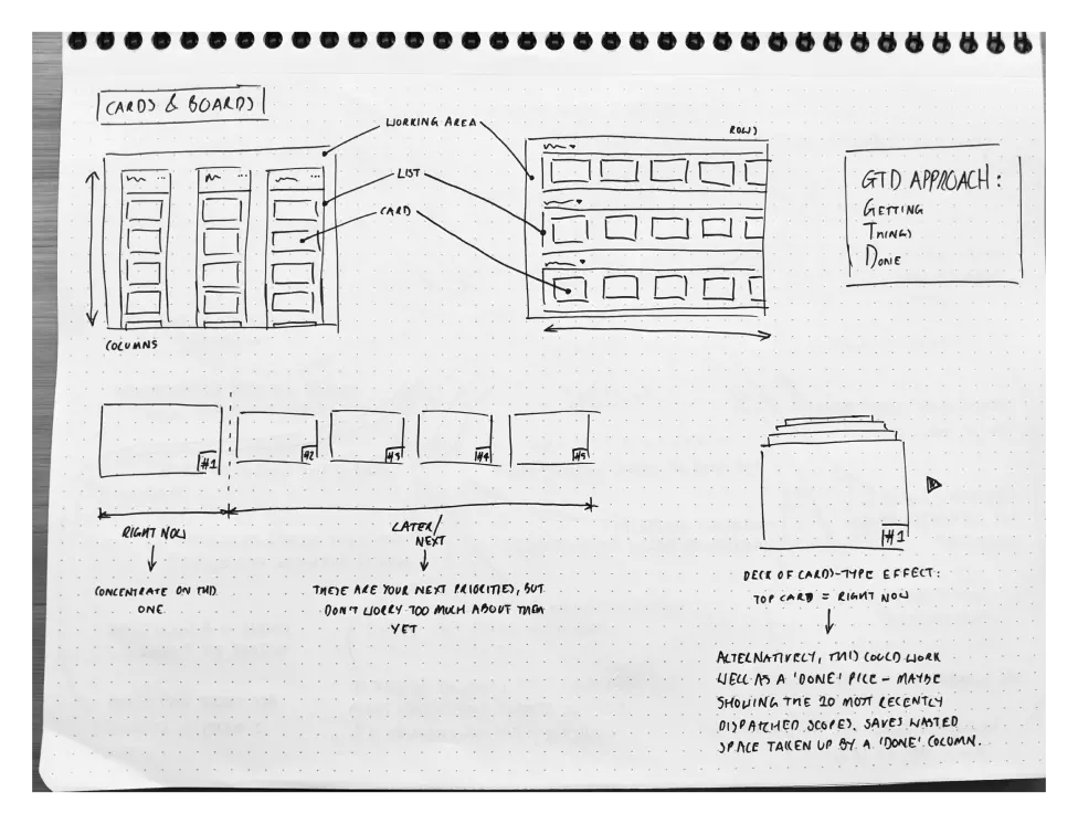
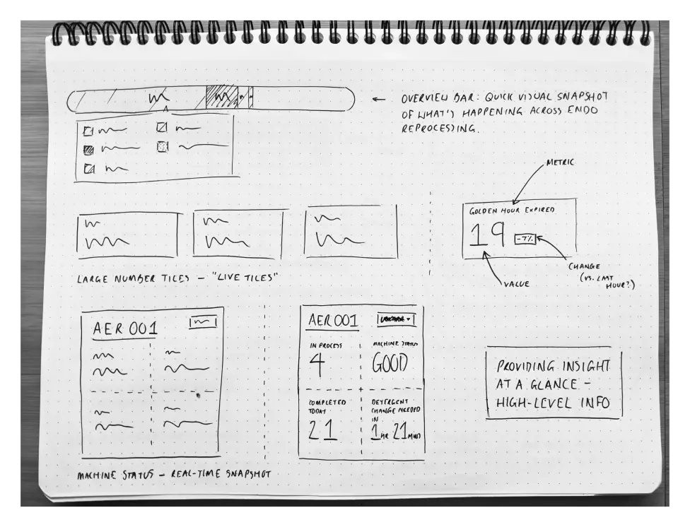
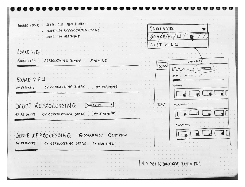
From pen to potential: These four pages capture the spark of design, transforming into initial wireframes for the Endoscopy Hub.
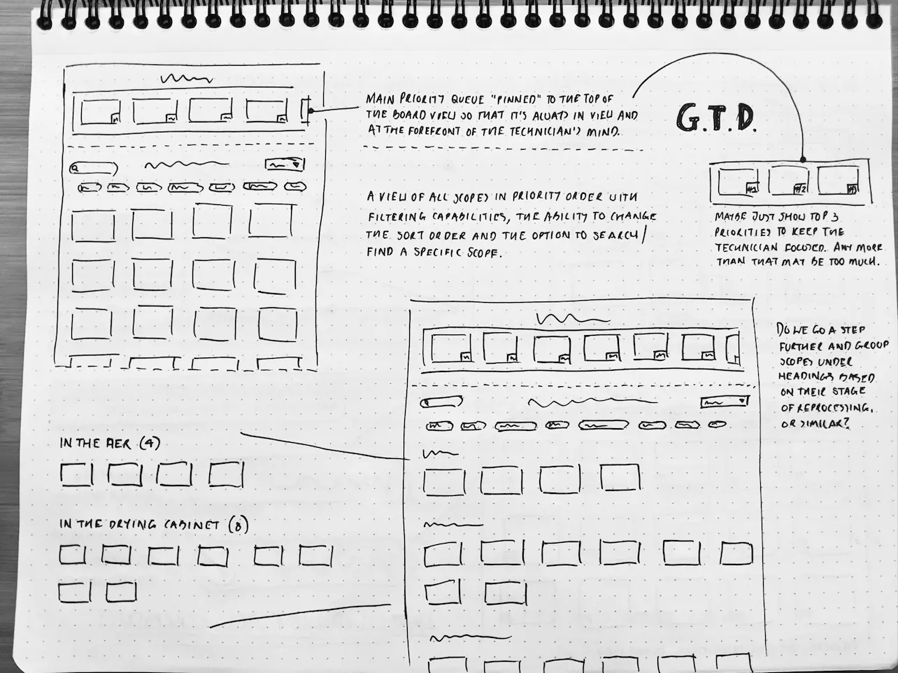
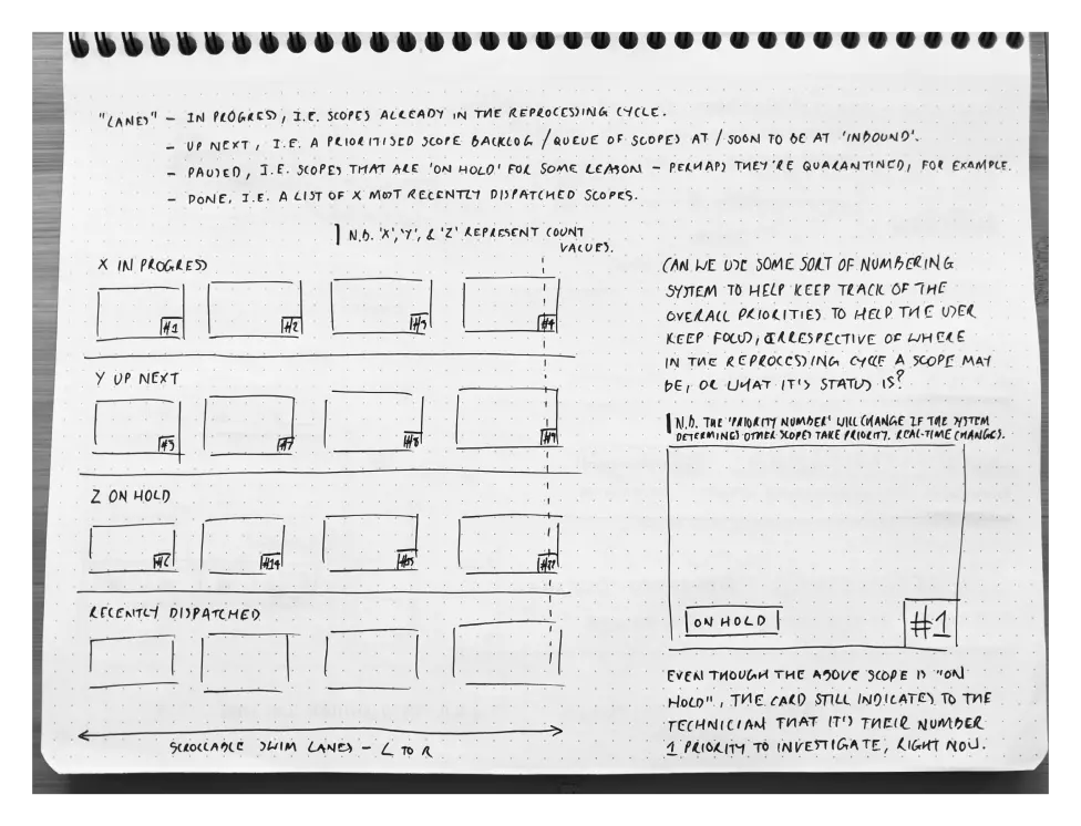
From Sketches to Solutions: Refining the "Hub" Wireframes
With a range of initial wireframes sketched, I actively solicited feedback from the ideation session participants. This collaborative approach proved invaluable, guiding me towards a card-based UI layout featuring dynamic "live" tiles.
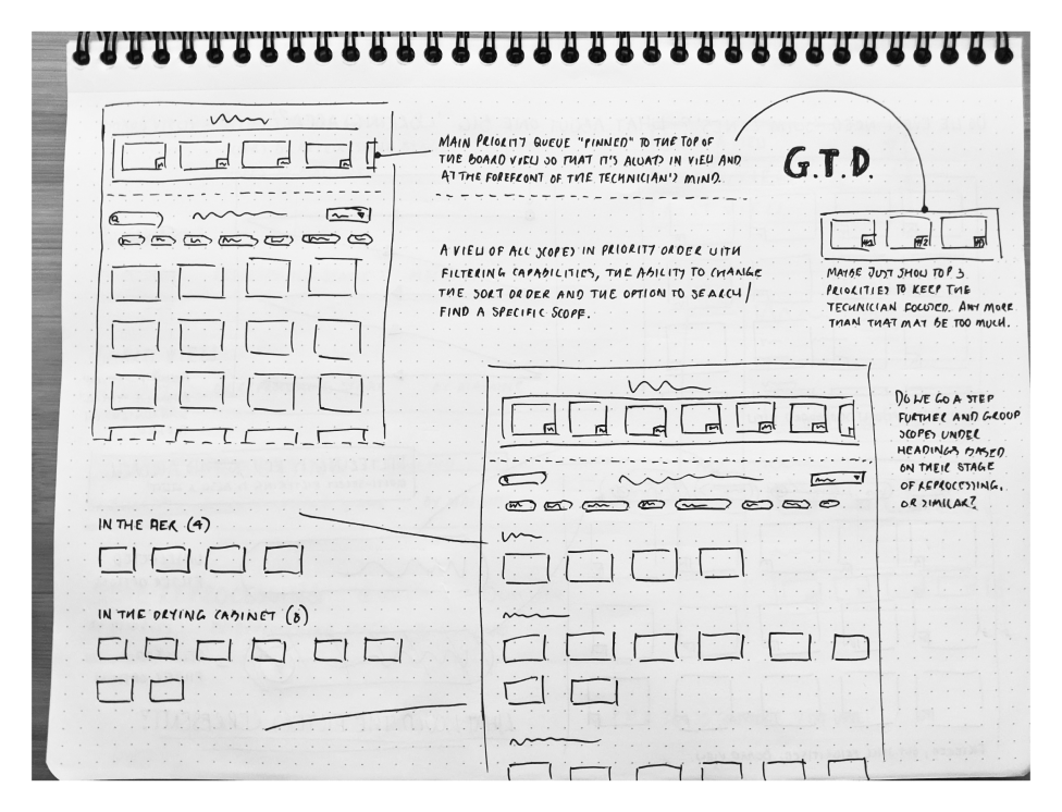
Drawing inspiration from David Allen's GTD methodology, I dedicated a prominent section at the top of the UI to three priority endoscopes requiring immediate attention: "Now," "Next," and "Soon." This mirrored the GTD approach of tackling tasks in a specific order based on urgency.
Furthermore, I explored the use of vertical and horizontal swimlanes as a prioritisation system for reprocessing endoscopes, incorporating the essential principles of Kitchen Display Systems (KDS). This leveraged the KDS model's focus on clear information display and efficient workflow management.
However, maintaining a glanceable design remained paramount. Excessive screen interaction by Technicians could hinder productivity, so I prioritised "Lean" operation.
This involved careful consideration of layout and sizing to ensure critical information was readily accessible without requiring multiple screen visits.
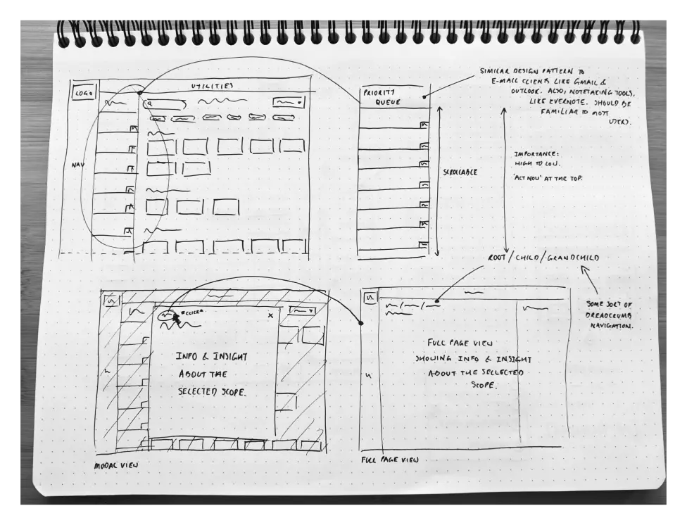
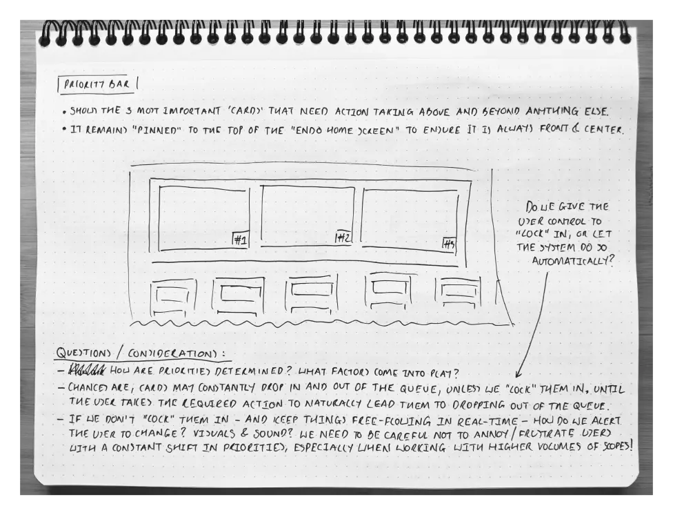
The design journey continues: These refined wireframes represent the next chapter, building upon the initial spark to envision a more tangible solution.
A Blossoming Seed: The Endoscopy "Hub" in Perspective
Though unable to personally see it through to completion due to an exciting opportunity to return to the E-commerce sector, the Endoscopy "Hub" project remains a valuable experience brimming with insights and a foundation for future development.
This shift in my career path, while ultimately leading me away from the project, didn't diminish the passion and dedication I poured into its initial stages. The wireframes, meticulously crafted with user feedback in mind and influenced by the principles of GTD and KDS, garnered positive feedback and hinted at a promising direction focused on efficiency and clear information for Technicians.
As a roadmap for potential future continuation, I would have considered these crucial next steps:
- User Validation: Engaging directly with Technicians, the target user group, would have been paramount to refine the concepts, identify potential improvements, and ensure the design truly addressed their needs.
- Iterative Refinement: Drawing upon user feedback, further iterations would have incorporated their insights to refine the design and solidify a clear vision.
- UI Transformation: With a validated and refined concept, transforming the wireframes into polished UI designs would pave the way for further development.
While the project remains unfinished, the seeds of innovation and user-centric design have been planted. The learnings and approaches documented here offer valuable lessons for future endeavours, potentially solidifying the "Hub" as an impactful solution for endoscopy technicians.

