Defying the Trend, Championing Innovation
In 2017, the UK's leading fashion and homeware retailer, Next, embarked on a transformative journey: shedding its traditional image to become a cutting-edge online fashion destination for a younger audience, all while retaining the loyalty of its established customer base.
Revamping the websites and apps was central to this strategy, but a contentious debate arose around the navigation design. The E-Commerce Director championed the popular "burger menu" trend, but my existing design, the "Snail Trail" (nicknamed for its resemblance to a snail's path), offered a compelling alternative.

Inspired by Microsoft's user-friendly Metro design on Windows Phone 7, the "Snail Trail" boasted superior discoverability and user satisfaction thanks to its intuitive horizontal swiping and "peek" effect, seamlessly revealing more options.

Data backed its effectiveness two years earlier in 2015: compared to the previous "burger menu," it led to between 50% and 70% higher click-through rates on both top-level departments and even secondary and tertiary subcategories. Purchase conversion was also up 0.5 percentage points.
Determined to champion user needs, my mission was not just to defend the "Snail Trail," but to demonstrate its clear alignment with the "premium" vision.
However, convincing the E-Commerce Director required more than past data. We needed fresh insights that demonstrably linked the "Snail Trail's" familiar Metro-inspired interface to the "premium" vision, showcasing its positive impact on discoverability, conversion, and ultimately, sales.
Challenge Accepted
Following internal discussions and collaborating with the Marketing Team to understand shoppers' perception of "premium," I embarked on a global market analysis.
My target: identify leading "premium" retail players and dissect their mobile website navigation designs. The scope was broad, encompassing diverse brands – from established names like Reiss, Boden, and Harvey Nichols to luxury giants like Chanel, Moschino, and Tom Ford.
The stark discovery? An overwhelming majority favoured the burger menu.
This presented a significant challenge: how could we achieve a "premium" feel while defying the seemingly ubiquitous trend?
Instead of being discouraged, I saw this as an opportunity to push boundaries and showcase the value of user-centric design.
Unearthing User Preferences
While data is invaluable, truly understanding user sentiment often demands a unique approach. So, I embraced a "democratise design" strategy. Diving into over 70 international retail sites, I captured their mobile headers in a visual feast: a massive montage meticulously organised on a single A3 sheet. This became a design gallery in our bustling office, inviting colleagues to cast their votes with a simple scribble, transforming data into preferences.
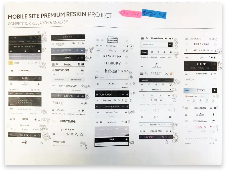
The results were clear: Reiss, ASOS, John Lewis, Liberty of London, All Saints, and Hugo Boss resonated most. But beyond individual choices, a unifying theme emerged – simplicity. Sleek black backgrounds dominated, contrasting with crisp white iconography and wordmark logos across these diverse brands. This minimalist aesthetic exuded elegance and sophistication, perfectly aligning with the "premium" vision.
This user-driven exercise wasn't just about analysing trends; it was about validating them. The clear preference for simplicity resonated with industry data, solidifying its key role in achieving a "premium" feel. This crucial finding would guide our navigation design journey.
However, while internal feedback proved invaluable, acknowledging limitations is crucial.
Incorporating actual customer preferences through broader testing (e.g., online surveys, A/B testing, in-person usability) would have further strengthened the foundation.
This is an area I actively explore, committed to incorporating external feedback in future projects to ensure designs resonate not just internally, but with the target audience itself.
Embracing Exploration
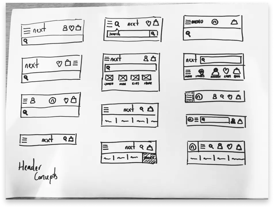
While the "burger menu" didn't align with my vision for a seamless user experience, exploring its potential within the "premium" context was essential. To do this, I embarked on a rapid 10-minute iteration session, generating 13 unique mobile header designs.
Initially, churning out new ideas was easy. However, maintaining originality and addressing key user needs like search functionality presented challenges.
Key Considerations Emerged:
- Ergonomics: Left-handed vs. right-handed usage, optimal thumb reach, and potential benefits of bottom-placed navigation (like app "tab bars").
- Visual balance: Balancing the Next logo with surrounding icons for optimal aesthetic appeal.
- Search accessibility: Balancing screen real estate with encouraging search-first behaviour.
These considerations, while initially presenting roadblocks, sparked further ideas and helped me push beyond the status quo.
While brainstorming solo had its merits, I acknowledge the potential benefits of the "Crazy 8's" technique and collaborative approaches for future iterations. Involving others could have broadened perspectives and led to even richer and more diverse solutions.
Despite these reflections, I'm proud of the volume and variety of ideas generated. These explorations laid the groundwork for the next stage, where I would refine and combine the most promising elements to create a "premium" navigation solution that addressed both user needs and aesthetic considerations.
Refining the Vision
Internal feedback and real-world data (courtesy of Google Analytics) honed diverse "burger menu" concepts. While the familiar left-hand placement remained preferred, the potential "thumb-stretch" concern for right-handed users warranted further evaluation. I hoped to address this through future usability testing to ensure optimal user comfort and accessibility.
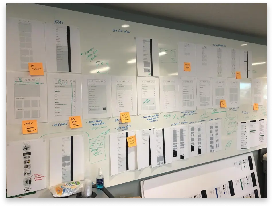
Understanding our complex information architecture was crucial. I mapped primary "drawer" links for seamless integration and future growth. User journeys from Google Analytics were translated into interactive whiteboards, where colleagues provided feedback on familiar shopping routes.
This delicate balance—respecting user preference while prioritising intuitive exploration—guided next steps: meticulously refining and combining the best elements into an optimal "premium" navigation solution.
The vast information within our IA presented a challenge: overwhelming lists of links. To combat this, visual components were explored. While an in-depth IA audit was beyond scope, collaboration with E-Commerce Category Managers yielded valuable insights.
While endorsing banners for targeted marketing, E-Commerce Managers suggested limiting them to the "drawer's" primary links. But these weren't just visual breaks; they'd act as signposts to our "Spreads," a nod to the beloved Next catalogue, offering visual browsing and escaping endless PLP scrolls. By seamlessly integrating "Spreads" through these banners, we bridge the gap between traditional and digital shopping, boosting engagement and satisfaction.
From Whiteboards to Figma
Armed with the insights gleaned from our interactive whiteboard sessions, I streamlined the diverse burger menu concepts into a singular, refined wireframe. Eager to translate this vision into a tangible user experience, I meticulously crafted a functional prototype within the versatile Figma platform. This prototype wouldn't just sit on a screen; it was ready to be brought to life through user testing and evaluation.
Enter the bustling Staff Coffee Shop during its mid-morning rush. With working prototypes loaded on test devices, I conducted some "guerrilla testing" right then and there. Willing participants first tackled the existing "Snail Trail" navigation, followed by the new burger menu prototype. This quick-fire approach, leveraging the accessibility of on-site employees, served as a crude preference test and initial usability check for the burger menu concept.
While speed and time were of the essence, the bustling environment and participants' quick coffee breaks didn't always yield deeper insights beyond "I like them both" or "I prefer this one." It was clear I needed a change of tact to gather more meaningful feedback.
Scaling Up
The Staff Coffee Shop's "guerrilla testing" provided valuable direction, but I craved a larger, quantitative view on staff preferences. After all, many Next employees are also avid customers, offering unique insights. Leveraging the sheer size of our Head Office, I devised a quick and efficient solution: a company-wide preference test.
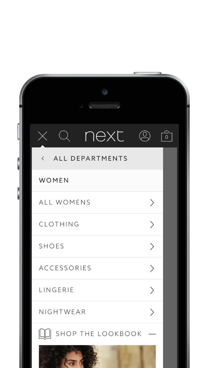
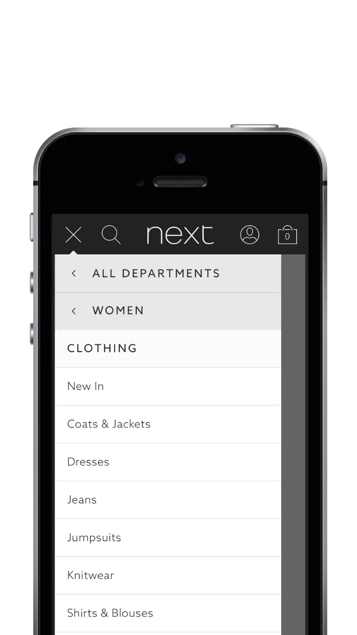
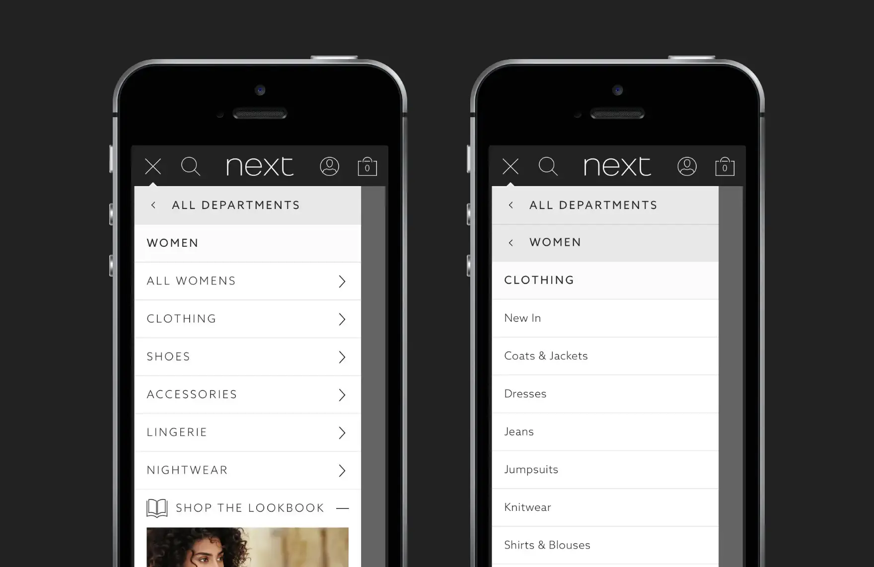
Burger Menu: Highlighting primary and secondary levels of navigation in the "Women" department.
This online test asked both UX and Marketing teams to compare the Snail Trail and burger menu prototypes before selecting their preferred option. However, the results proved inconclusive. The department voted 50/50, mirroring the internal debate about adopting the new design.
Undeterred, I broadened the poll to encompass the entire company. Within 24 hours, over 500 responses poured in, revealing a narrow 51/49 preference for the existing navigation. Despite the razor-thin margin, the data suggested maintaining the status quo.
The inconclusive internal polls demanded a definitive answer. Time to enter the heart-pounding realm of live A/B testing, where user behaviour reigns supreme.
Live A/B Testing Unveils the Truth
With the help of our Infrastructure Team, we meticulously crafted two website variants: "Control" mirroring our existing "Snail Trail" horizontal navigation and "Test" showcasing the revamped burger menu. A 20% segment of real website traffic was then diverted to each version, ensuring a fair and controlled trial.
To account for the inherent volatility of fashion retail's seasonal trends, I strategically ran three separate A/B tests across diverse timeframes. Each day, I meticulously analysed the impact on our predefined "Success Metrics," keeping the Senior Leadership Team informed every step of the way.
The results, while clear, weren't what the E-Commerce Director had hoped for – in the best possible way. Across all three tests, the "Control" consistently reigned supreme.
This unexpected, yet welcome, outcome provided valuable insights into user preferences and highlighted the crucial role of real-world testing within the dynamic online shopping landscape. It confirmed the "Snail Trail's" enduring strength and provided a solid foundation for future navigation improvements.
The Numbers Speak
While A/B testing often throws curveballs, the results in this case were both clear and decisive. Presenting the burger menu to Next shoppers yielded a demonstrably negative impact, affecting key metrics across the board:
Financial Performance:
- Sales Revenue: 9.10% decrease compared to the control group.
- E-Commerce Conversion Rate (C/R): Down by 0.35 percentage points.
- Average Order Value (AOV): Decreased by £2.38 per order.
These figures painted a stark picture, potentially translating to an estimated £135 million sales revenue shortfall over a 10-month period had the burger menu been implemented.
Engagement with Core Navigation:
- Top-Level Category Taps: All categories, from "Women" and "Men" to "Home" and "Christmas", saw a dramatic drop in user engagement, ranging from 53% to 72% fewer taps.
This significant decline suggested that while the burger menu might have offered a different navigation experience, users struggled to find and interact with key product categories they were accustomed to accessing through the existing horizontal navigation.
Conclusion
The A/B testing results cemented the "Snail Trail" as the optimal navigation system for Next's users at that time, highlighting the importance of prioritising user needs and championing data-driven decision making. My advocacy, based on evidence and insights, helped avert a potential £135 million loss over a 10-month period, a remarkable achievement considering this excludes Next's peak Christmas trading period.
While my journey with Next has concluded, the project sparked a lasting belief that a comprehensive IA audit, coupled with user-led card sorting, could further refine the website's performance. While the navigation menu design played a critical role, the underlying IA structure likely holds even greater potential. It's encouraging to see the "Snail Trail" gaining traction among other retailers on mobile, a testament to its effectiveness.
However, with mobile devices reaching ever-increasing sizes, a bold vision emerges: could it be time to relocate the "Snail Trail" to the bottom of the viewport, creating a thumb-friendly zone similar to the app world's ubiquitous "Tab Bar" design pattern?
This innovative approach, while requiring future testing, could represent the mobile web's answer to intuitive and accessible navigation.
Looking ahead, my approach would prioritise even earlier user involvement, drawing inspiration and insights directly from the source. Continuous iteration and a relentless focus on user needs will remain guiding principles. After all, trends may fade, but the power of user-centric design and data-driven decisions endures. The "Snail Trail" journey may be over, but the pursuit of excellence in user experience continues, fuelled by an ever-evolving landscape and a thirst for innovation.

