The Headlines
Five hospital sites. Over 50 technicians observed. One fragmented workflow putting patients at risk, and a validated discovery direction for fixing it.
Briefed by STERIS's BA team, I took their groundwork into clinical environments across dedicated reprocessing units and hospital-based departments. Through technician shadowing, empathy mapping, and remote ideation workshops, I established that the problem was one of information hierarchy: technicians knew what was in the queue, but not what was urgent, delayed, or at risk of error. The discovery output delivered validated wireframes, design principles rooted in field research, and a strategic roadmap that gave STERIS a clear, evidence-based direction to build from.
Familiar Ground
STERIS is a global leader in surgical instrument reprocessing, the clinical process that makes endoscopes safe for reuse between patients. Before joining as a UX Designer, I had spent years in the sector through my tenure at Synergy Health, prior to its acquisition by STERIS. I came to this project with an understanding of the environment that no amount of onboarding could replicate. The clinical pressures, the consequences of error, and the human realities of working in a reprocessing unit.
When the BA team briefed me on the workflow inefficiency problem, they had already laid the foundations. My role was to take that groundwork into the field and return something more rigorous: a research-led direction grounded in what technicians actually experienced, not what the systems recorded.
A Workflow Where Errors Reach Patients
Endoscope reprocessing follows a tightly defined sequence. Each scope must pass through cleaning, disinfection, and storage before it can be used on another patient. Miss a step, rush a stage, or lose track of where a scope is in the process, and the consequences aren't administrative. They're clinical.
The problem the BA team had identified was fragmentation. Technicians were managing this time-pressured workflow across disconnected systems, with no centralised view of what was urgent, what was delayed, or where the process was at risk. Manual workarounds filled the gaps. They weren't a solution. They were a symptom.
Five Sites. Over 50 Technicians.
Understanding the workflow meant observing it. I visited five sites across the Midlands and North of England: two dedicated reprocessing units at Knowsley and Sheffield, and three hospital-based departments at Wythenshawe, New Cross in Wolverhampton, and Royal Derby. Each environment had a different operational structure, different staffing pressures, and different physical layouts.
Across all five, I observed over 50 technicians at work. In-depth conversation wasn't always possible. Reprocessing follows a strict sequence of steps, technicians are frequently multi-tasking, and turnaround times are tight. Scopes are often requested at short notice by clinicians for patients already on site. Interrupting someone mid-sequence risked a missed step. So I observed closely, documented carefully, and spoke in depth where the opportunity arose.
The environments varied. The problems didn't.
What the Research Revealed
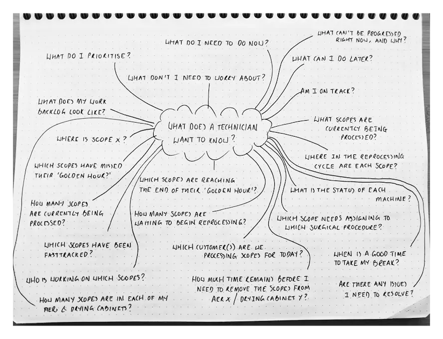
The synthesis work that followed the site visits centred on a single question: what does a technician actually need to know, at any given moment, to do their job well?
The answer wasn't complicated. Urgency. Status. Backlog. Exceptions. In that order, at a glance.
The existing systems weren't designed around that hierarchy. They were built for data capture, thorough in what they recorded, but not shaped for decisions made under time pressure. Technicians had the information. They just couldn't act on it quickly enough. That gap was the problem worth solving.
The design reference that sharpened the concept came into focus during a lunch break at McDonald's. Watching the kitchen display manage a constant flow of concurrent orders, each at a different stage and each with a different urgency, I recognised the same structural problem endoscopy technicians were solving every day, in a completely different environment. The insight wasn't accidental. It was the product of having spent weeks immersed in a reprocessing workflow and knowing exactly what it needed.
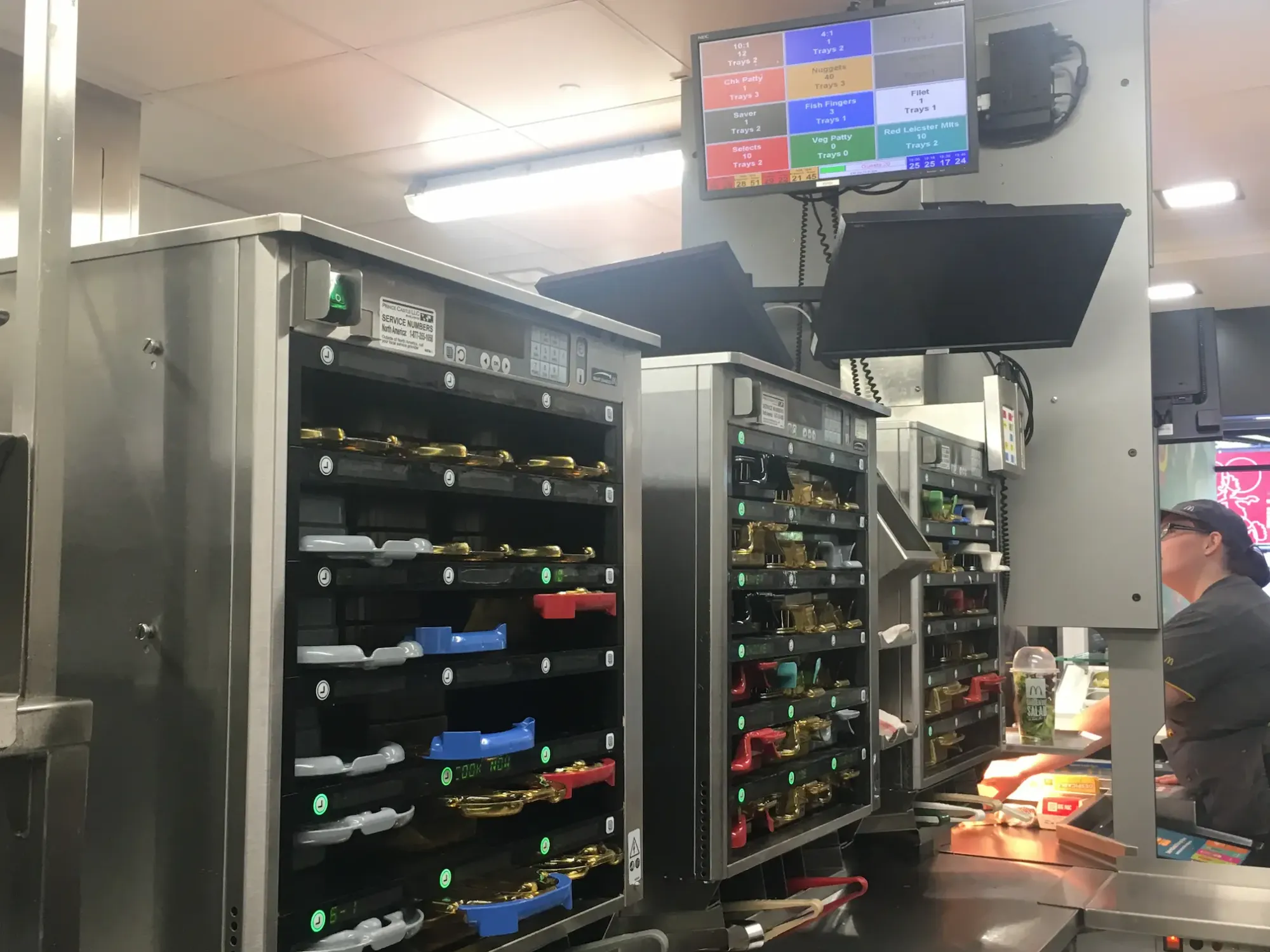
KDS interfaces are engineered for environments where order flow is high-volume, time-pressured, and error-intolerant. The conditions in a reprocessing unit are directly comparable. Applying that principle to endoscopy workflow wasn't a creative leap. It was a logical one.
I paired this with Getting Things Done methodology, using its Now / Next / Soon prioritisation structure to give the information architecture a proven framework for managing parallel workloads under pressure.
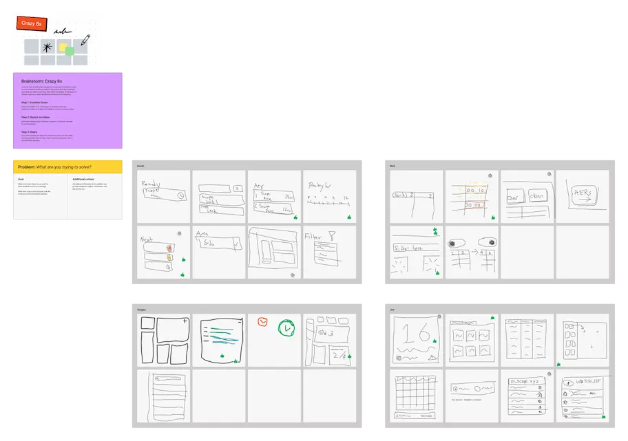
With the research synthesised and the conceptual direction established, I facilitated remote ideation workshops in FigJam — Crazy 8s sketching, dot voting, and theme mapping — to generate and pressure-test specific design directions before moving to wireframes.
From Insight to Wireframe
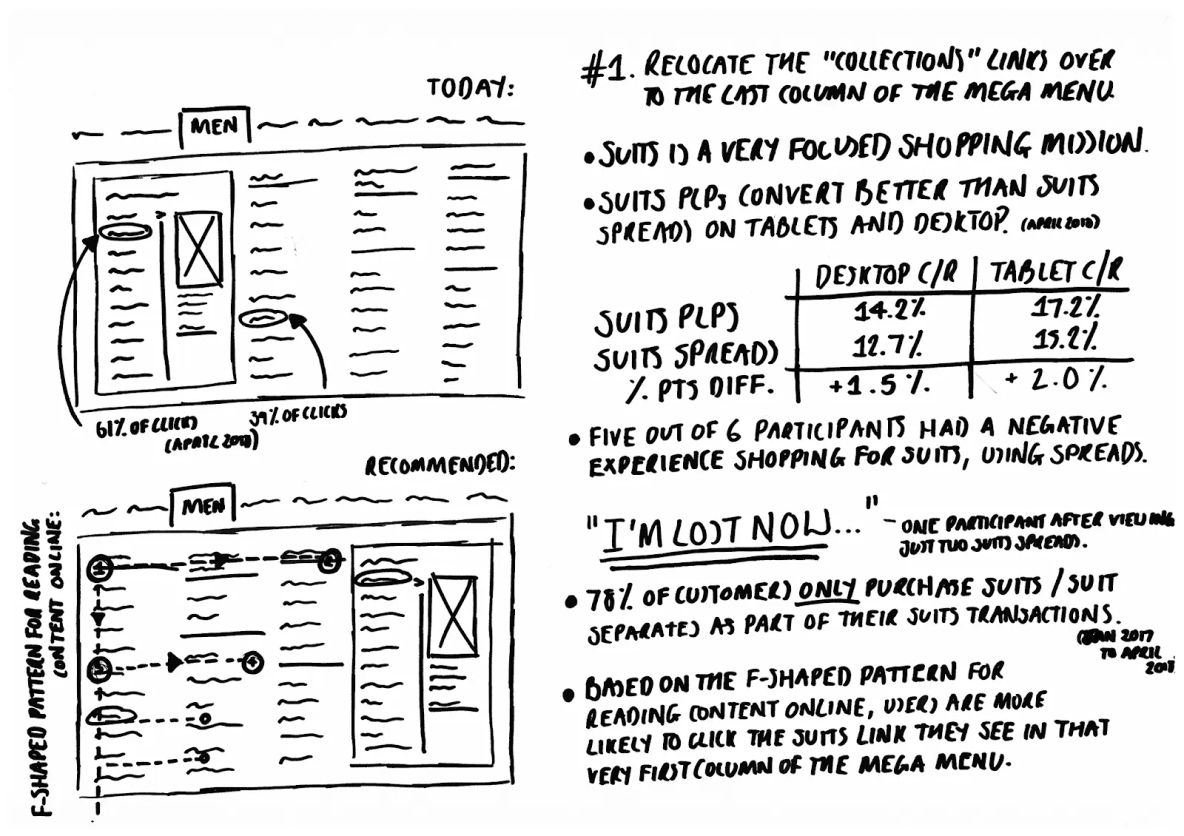
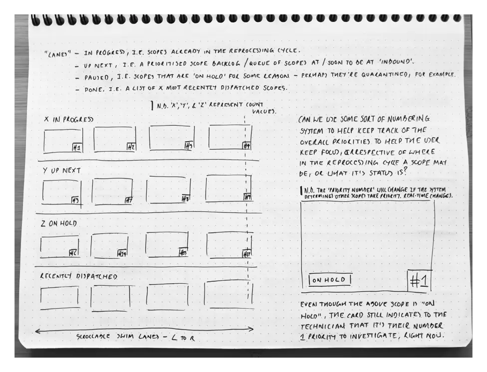
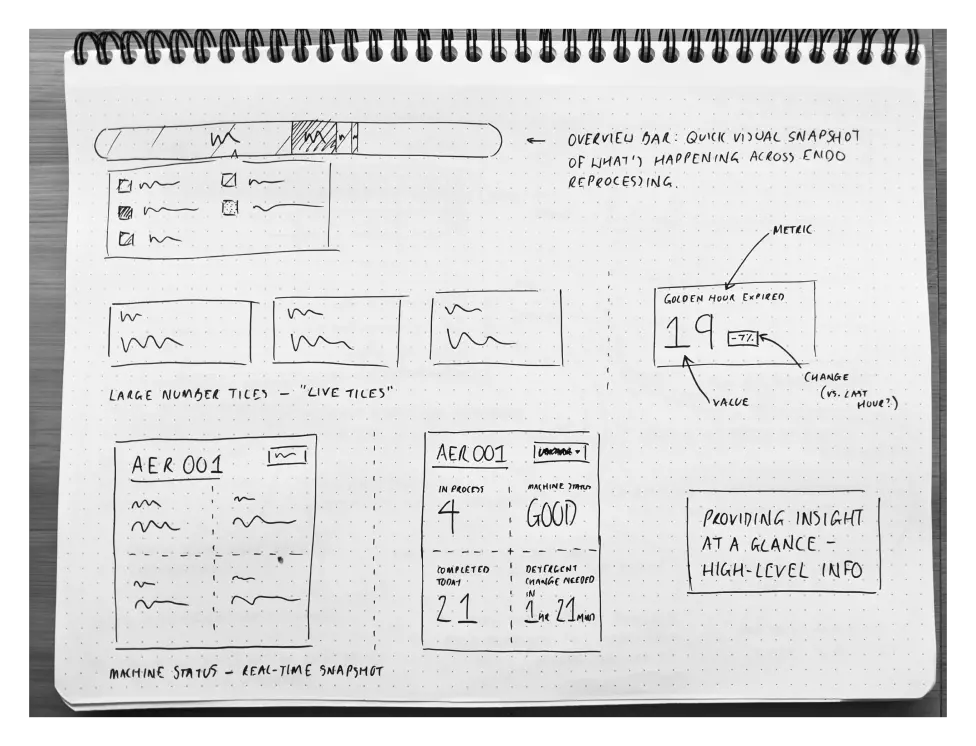
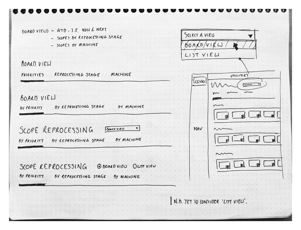
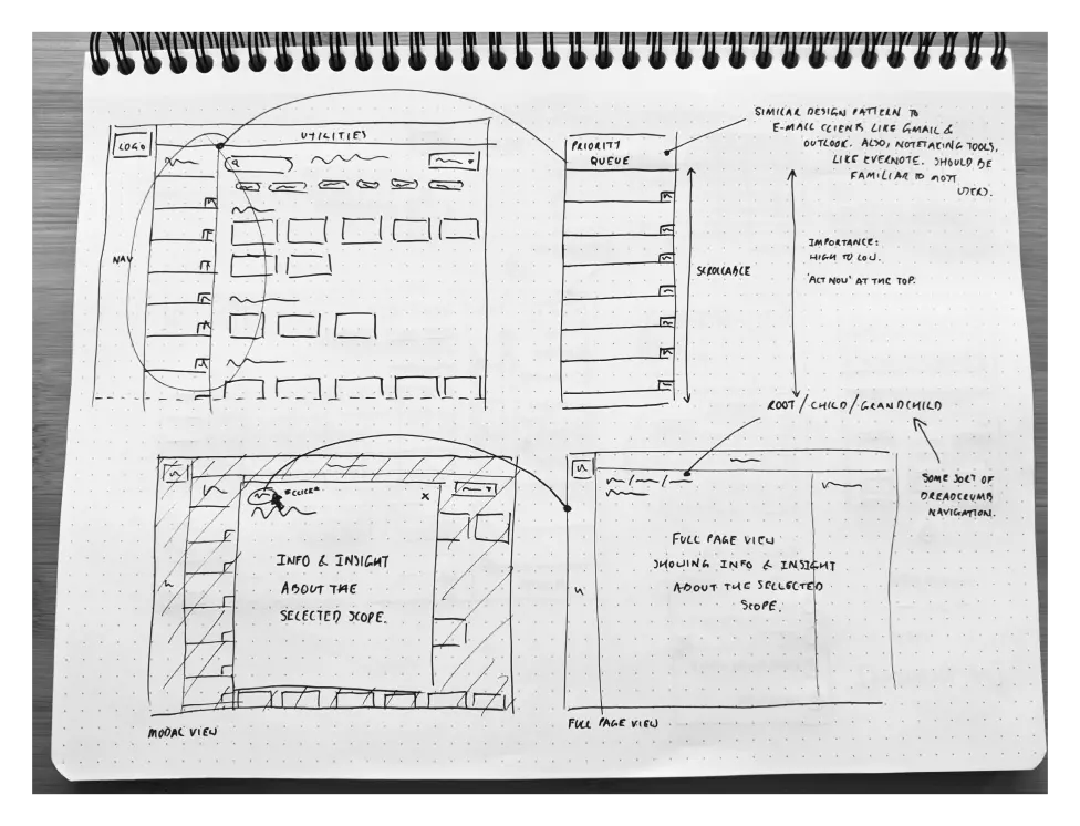
I started with Sharpie sketches on dot grid paper, keeping the ideation phase fast and low-commitment. Early concepts explored priority columns structured around Now, Next, and Soon, live tiles showing scopes at each stage of reprocessing, and swimlane layouts clustering tasks by urgency or status. Each direction was a direct response to the same field research finding: technicians needed to see what was urgent, what was in progress, and what was at risk, without having to search for it.
From there I moved into Whimsical to refine the strongest directions digitally. The first round of wireframes tested card-based layouts and live tile structures. The second round tightened the concept into a glanceable, tile-based interface with a clear prioritisation hierarchy, built around the Now / Next / Soon structure that had proven effective in both KDS environments and GTD methodology.
The wireframes didn't come from creative intuition. They came from five hospital sites and fifty technicians.
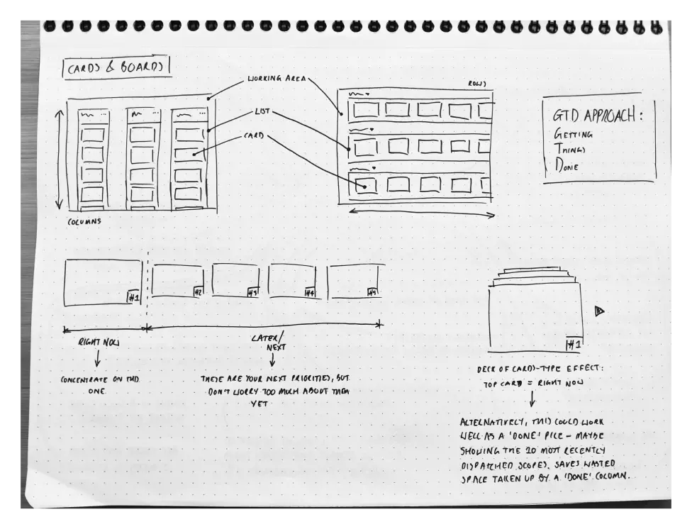
Four distinct structural approaches, each one interrogating a different answer to the same question. The annotations show a researcher who hasn't settled on a direction yet, and is deliberately making sure they shouldn't.
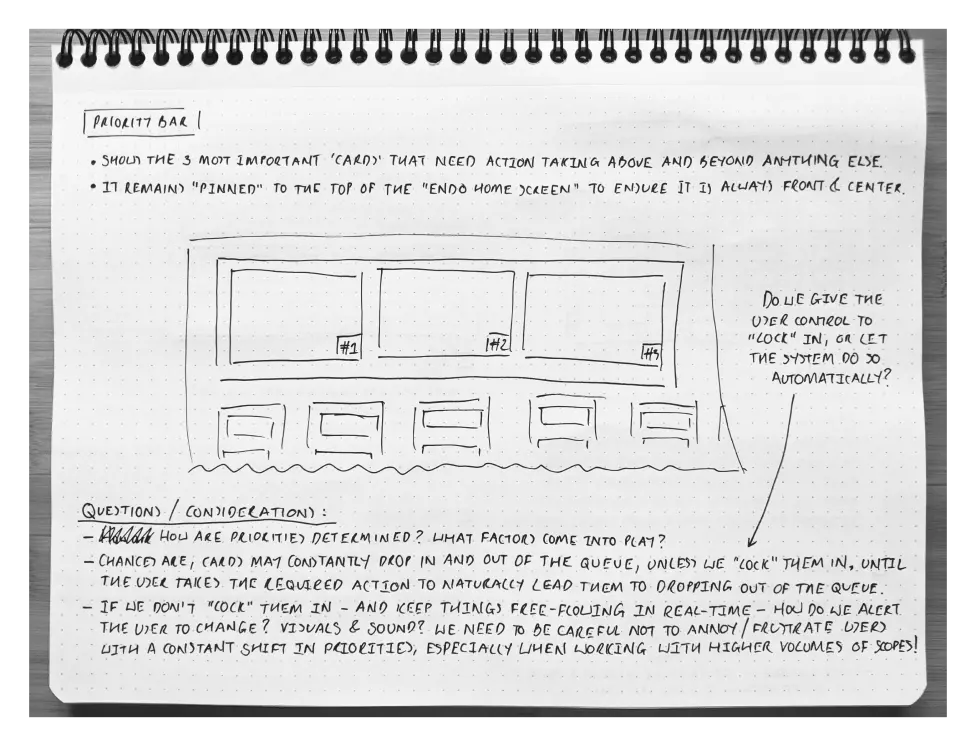
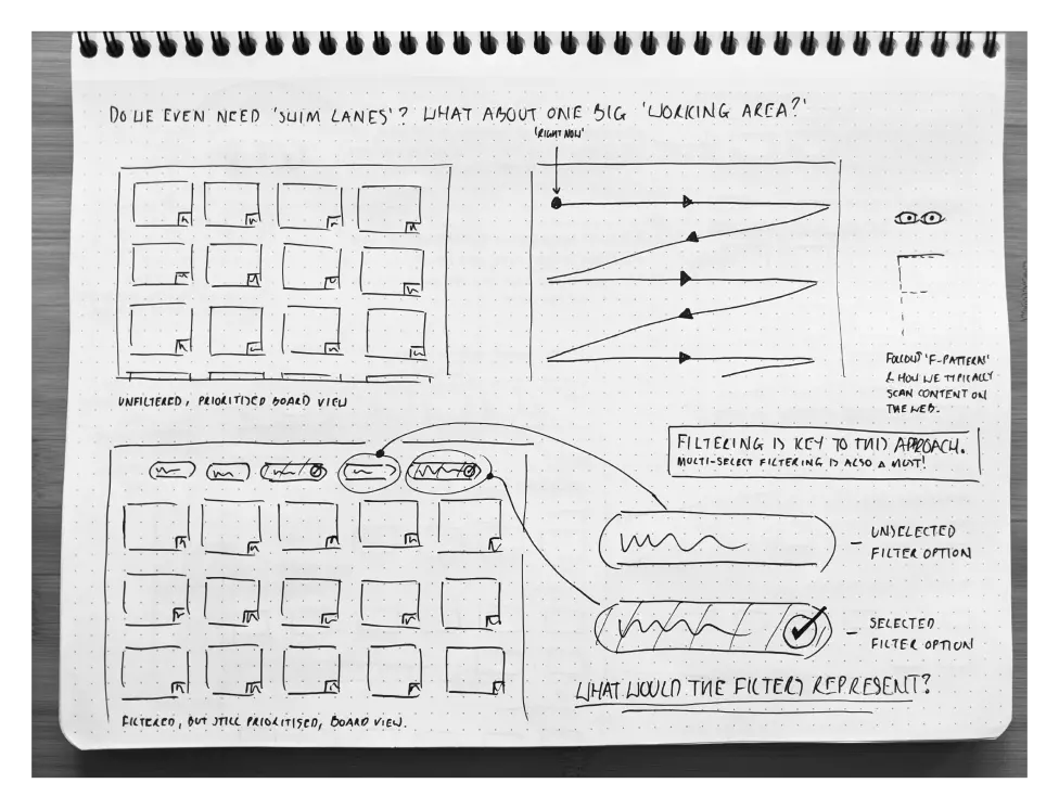
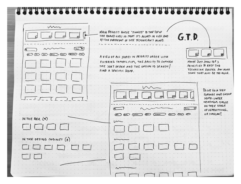
A second iteration that questions the first. Swim lanes challenged. Filtering requirements established. Priority locking debated. The annotations aren't notes for a handoff. They're a researcher arguing with themselves until the reasoning holds.
What the Discovery Phase Delivered
The discovery output gave STERIS a research-led foundation to build from. Low-fidelity wireframes across two rounds of iteration, showing the Endoscopy Hub concept from initial sketch to refined tile-based interface. Design principles rooted in field observation, KDS frameworks, and GTD methodology. A strategic roadmap scoping the path from validated concept to high-fidelity prototype and clinical implementation.
Stakeholders aligned on the direction. In a clinical environment, where the consequences of getting a workflow wrong reach patients, that alignment doesn't happen without evidence. The research provided it.
Where the Research Points Next
The field research established what the problem is, why it matters, and what a solution needs to do. The value of getting that foundation right is that everything built on top of it starts from an honest place.
Returning to technicians across the same five sites with the wireframe concepts would be the first test — whether the prioritisation structure holds up when a reprocessing unit is running at capacity, not just when it's being observed. High-fidelity prototyping would follow, built for clinical display environments: high-contrast, accessible, legible under pressure. Integration scoping would establish the data inputs and system dependencies a production build would need to account for before a line of code is written.
The discovery work didn't just generate ideas. It created the conditions for confident implementation.
What This Project Taught Me
Embedded research in a clinical environment sharpens something that desk research can't: the discipline of observing without disrupting. In a reprocessing unit, the cost of interruption is real. That constraint forced a different kind of attention, watching more carefully, asking less frequently, and trusting the observations to do the work that interviews couldn't.
The cross-domain insight that shaped the concept wasn't luck. Recognising a McDonald's kitchen display as a structural analogue for endoscopy workflow was the product of deep immersion in a specific problem. Researchers who carry a broad frame of reference see connections that specialists miss. That's not a soft skill. It's a disciplined habit.
The validation phase this project never reached is the thing I'd prioritise first on any equivalent brief. A validated discovery direction is only as strong as the assumptions it hasn't yet had to defend. A researcher's job isn't finished when the direction is set. It's finished when the direction has been challenged.